Retail Product Findability
Finding what you’re looking for
A store full of different languages.
A customer might search for Tahini. Is it in the ethnic aisle or with the peanut butter?
An employee might know it by a completely different internal code.
The inventory system had its own logic. The warehouse had another. And every store had slightly different physical layouts.
The problem wasn't simply that products were hard to find.
There was no shared system for describing where things belonged.
I spent six months figuring out how all of those pieces could speak the same language.
6
months from research to design
18%
Faster product search
39%
Improvement in stocking efficiency
297
Stores with a scalable system
STARTING WITH THE STORE
Before designing anything, I needed to understand how the existing system actually worked.
I interviewed customers, cashiers, department managers, stockers, managers, and other employees across different parts of the store. I looked beneath the interface, studying the underlying database structure and GraphQL data to understand the constraints, relationships, and inconsistencies I was designing around.
I also trained as a department manager myself.
That gave me something interviews couldn't: firsthand experience with the legacy system, its jargon, its workarounds, and the small things employees had learned to do simply because the system didn't work the way they needed it to.
The goal was to make my blind spots as small as possible.
The more I investigated, the clearer it became:
This wasn't just a findability problem. It was a systems problem.
MAPPING THE EXPERIENCE
A product moves through a surprisingly large ecosystem before it reaches a customer's hands.
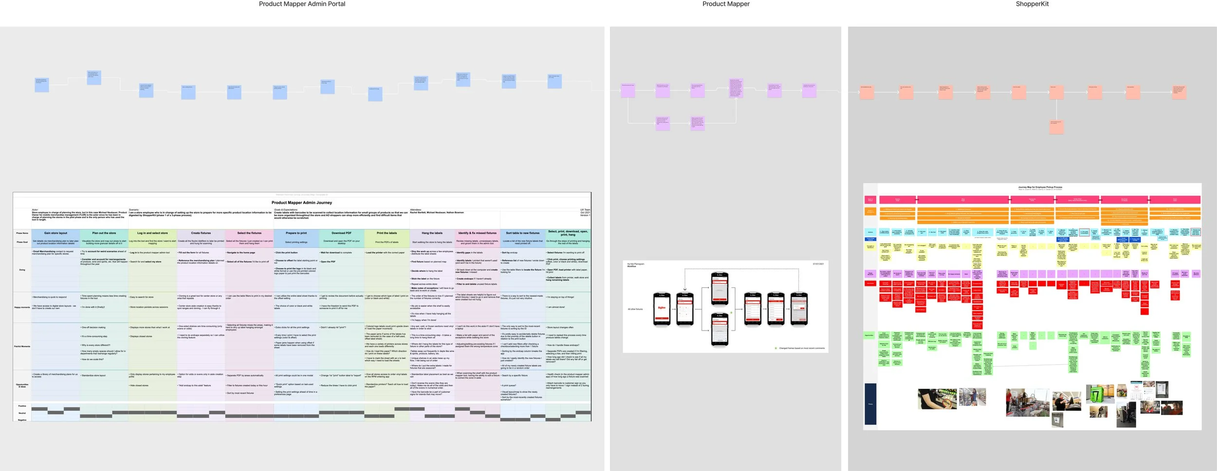
I created cross-product journey maps and a service blueprint to connect the experiences of customers, employees, digital products, physical stores, and the systems working behind them.
The maps helped reveal where information was created, transformed, lost, or misunderstood. It also highlighted where a single change could improve several experiences at once.
One physical shelf. Multiple journeys. One underlying system.
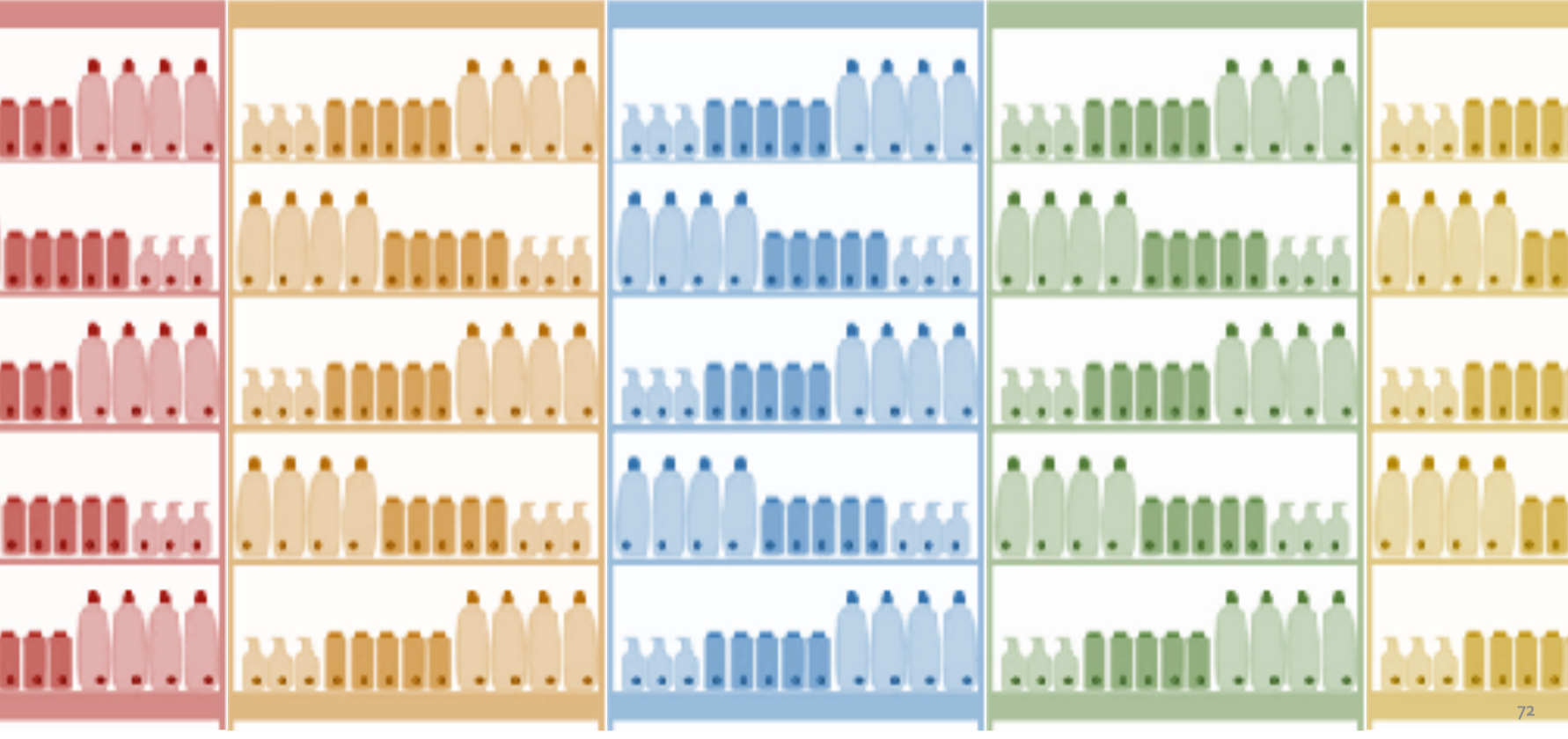
IT’s mental model of a section. A section can contain multiple categories of items (e.g. breads mixing with cookies in one overlapping section).
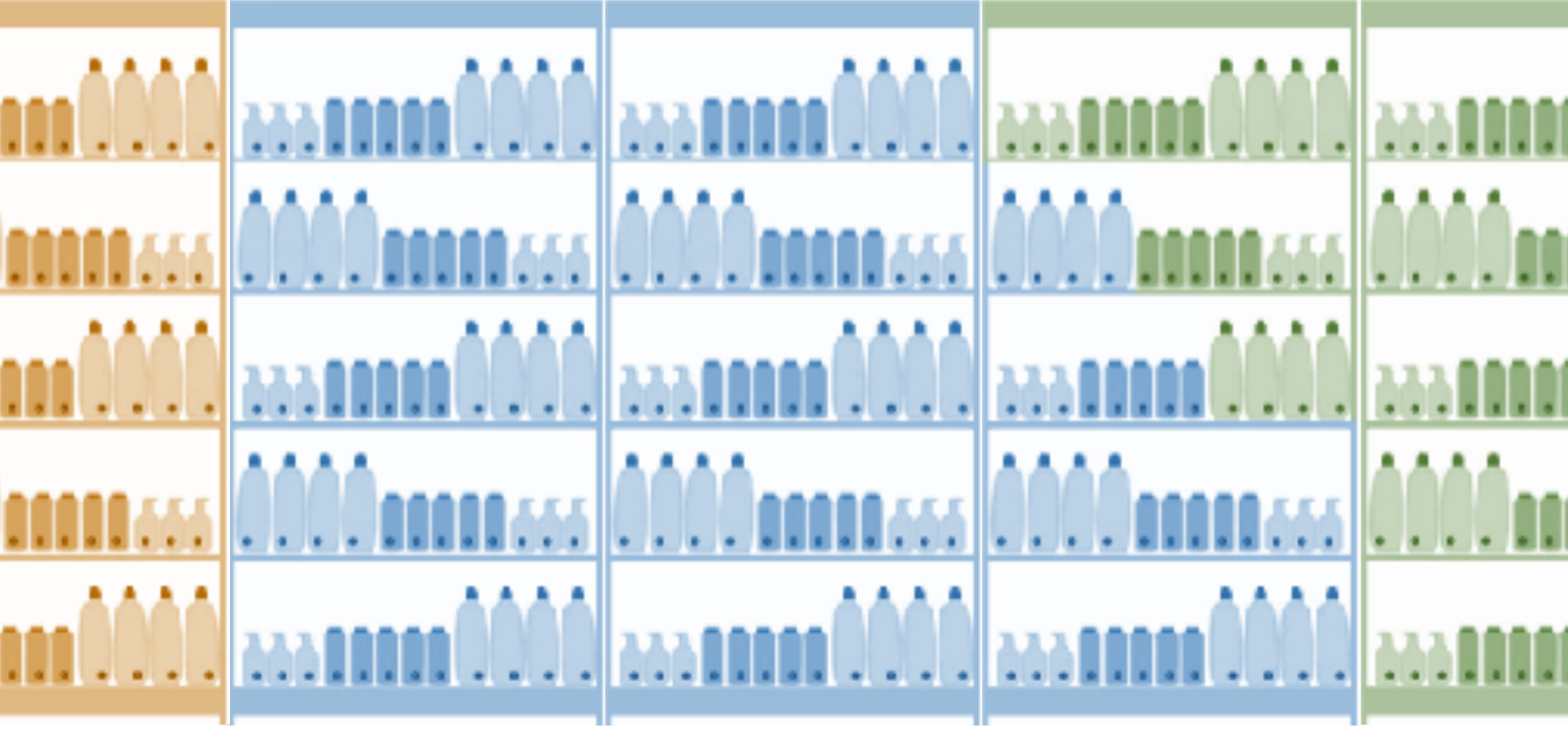
The store employee mental model of a section: the reality that all products from one category don’t neatly fill and fit into 3-foot sections.
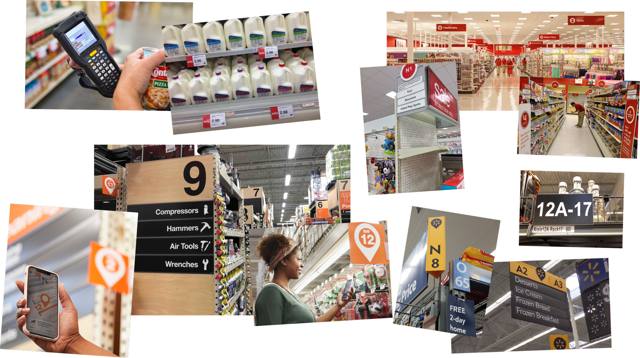
LOOKING EVERYWHERE FOR A BETTER LANGUAGE
I became slightly obsessed with naming systems.
I studied:
Retailers and grocery chains
Airports
Address systems
Warehouse and fulfillment-center conventions
Existing Hy-Vee inventory systems
Employee-facing location systems
Customer-facing navigation systems
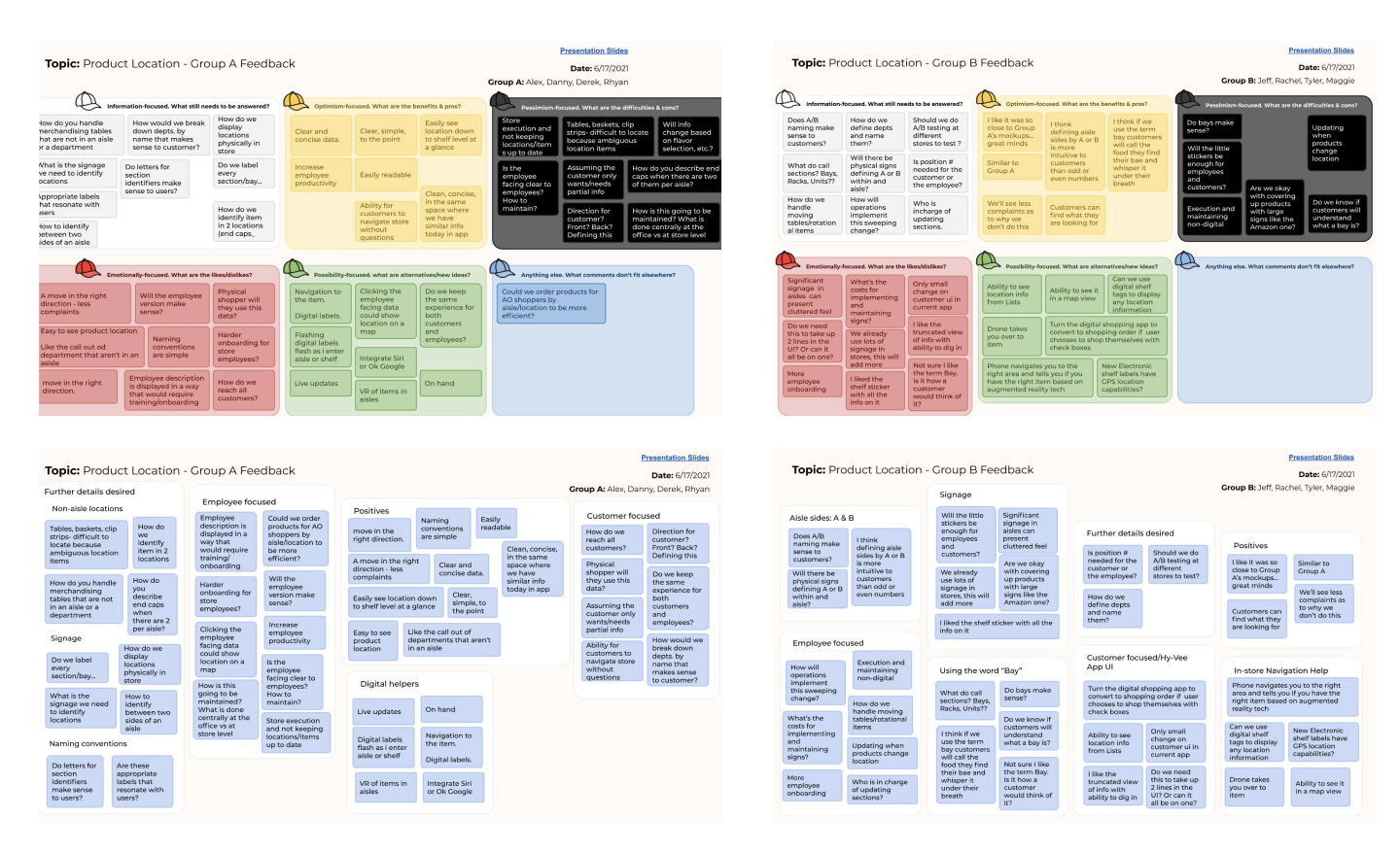
I even did some undercover sleuthing in competitor stores to understand how their employees organized physical space.
The question was always:
How do people turn a complicated physical environment into something they can understand, remember, and navigate?
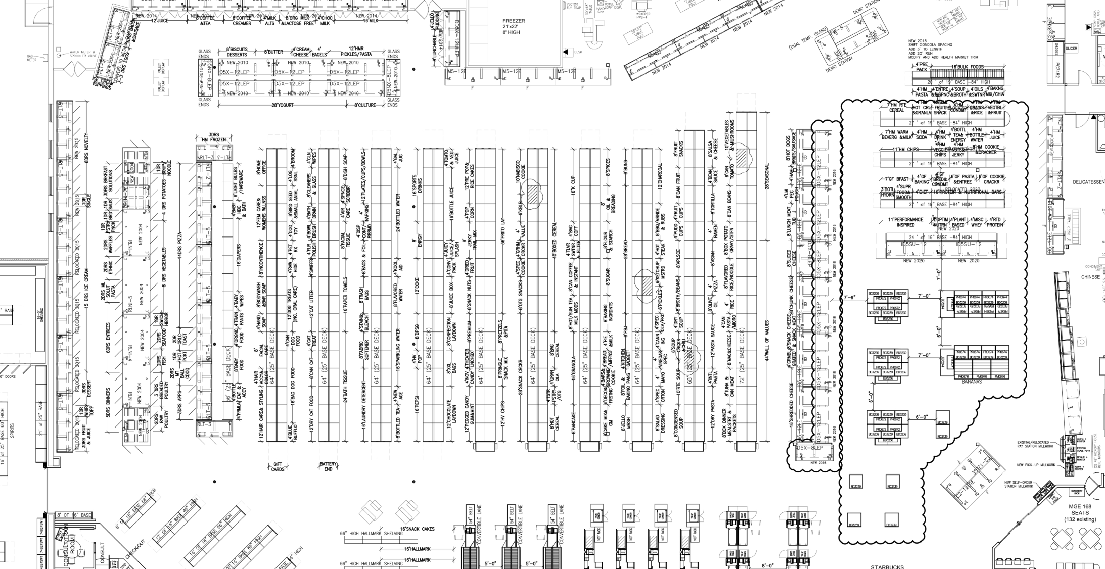
DESIGNING FOR EVERY STORE
Hy-Vee stores weren't identical.
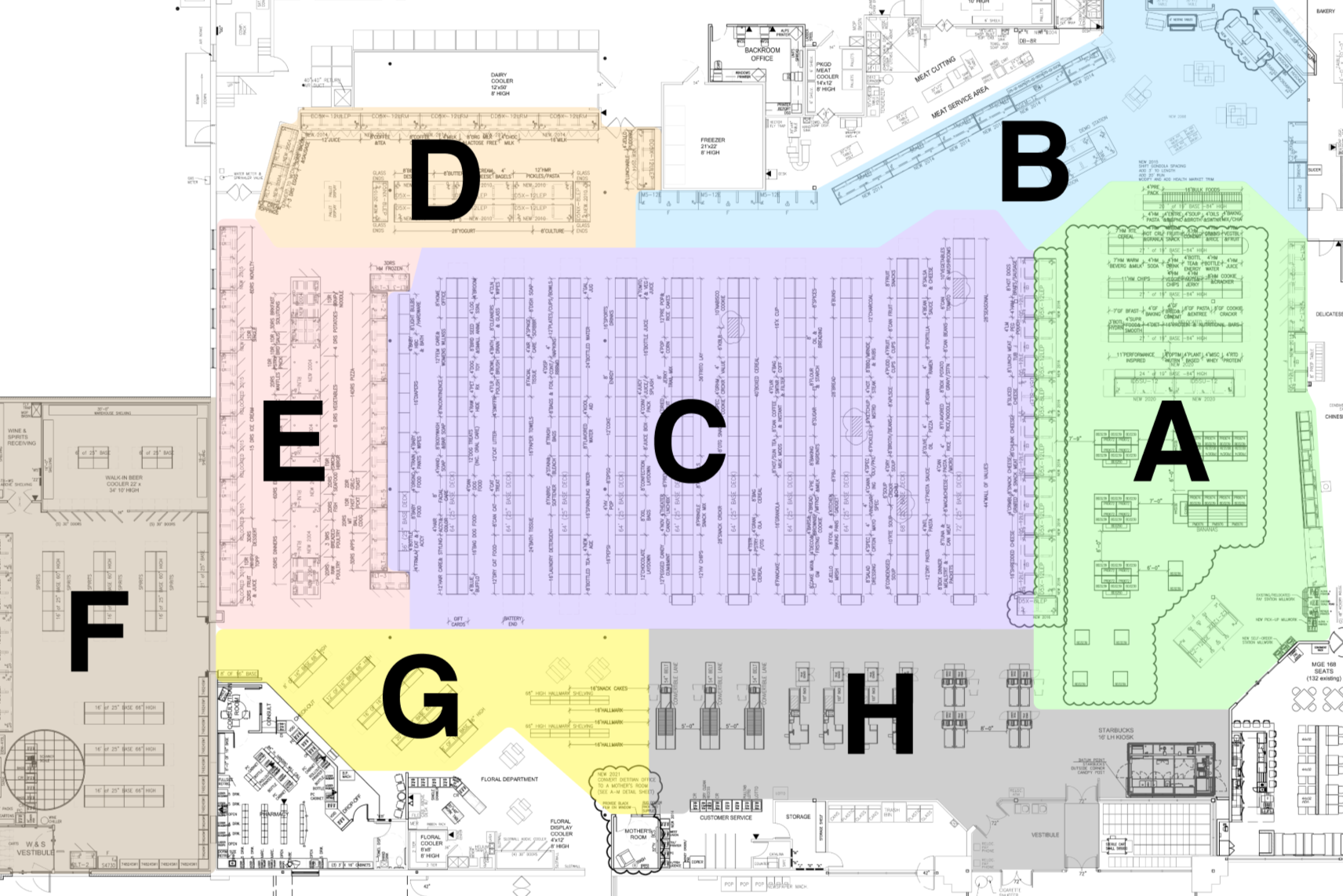
Different footprints, layouts, departments, and shelving configurations meant a system that worked in one store couldn't simply be copied into another.
I analyzed store blueprints to identify what stayed consistent across formats and where the system needed flexibility.
From that, I developed a store setup guide and location-naming framework that could scale across the chain.
The system created a common structure:
Area → Aisle → Shelf section/spot → Position
A three-foot section of shelving became a meaningful, trackable unit.
That seemingly small decision became the foundation for both customer navigation and inventory management.

A7 — 04 — 05 — 03
One piece of shelving.
One location.
A whole new way of understanding the store.
ONE PLACE. TWO LANGUAGES.
The new location architecture needed to work differently depending on who was using it.
FOR CUSTOMERS
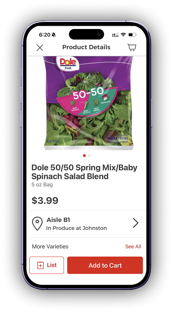
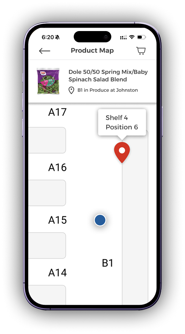
A product could be surfaced with a simple location:
Produce · Aisle A7 · Spot 4
From there, customers could see exactly where the product lived and eventually navigate to it through an in-store map experience.
The system was designed around the way people naturally understand physical space, not around the complexity of the systems behind it.
FOR EMPLOYEES
The same location became a much richer operational code:
A7-04-05-03
Each part identified a precise piece of the store:
A7 → aisle
04 → shelf section
05 → shelf
03 → position
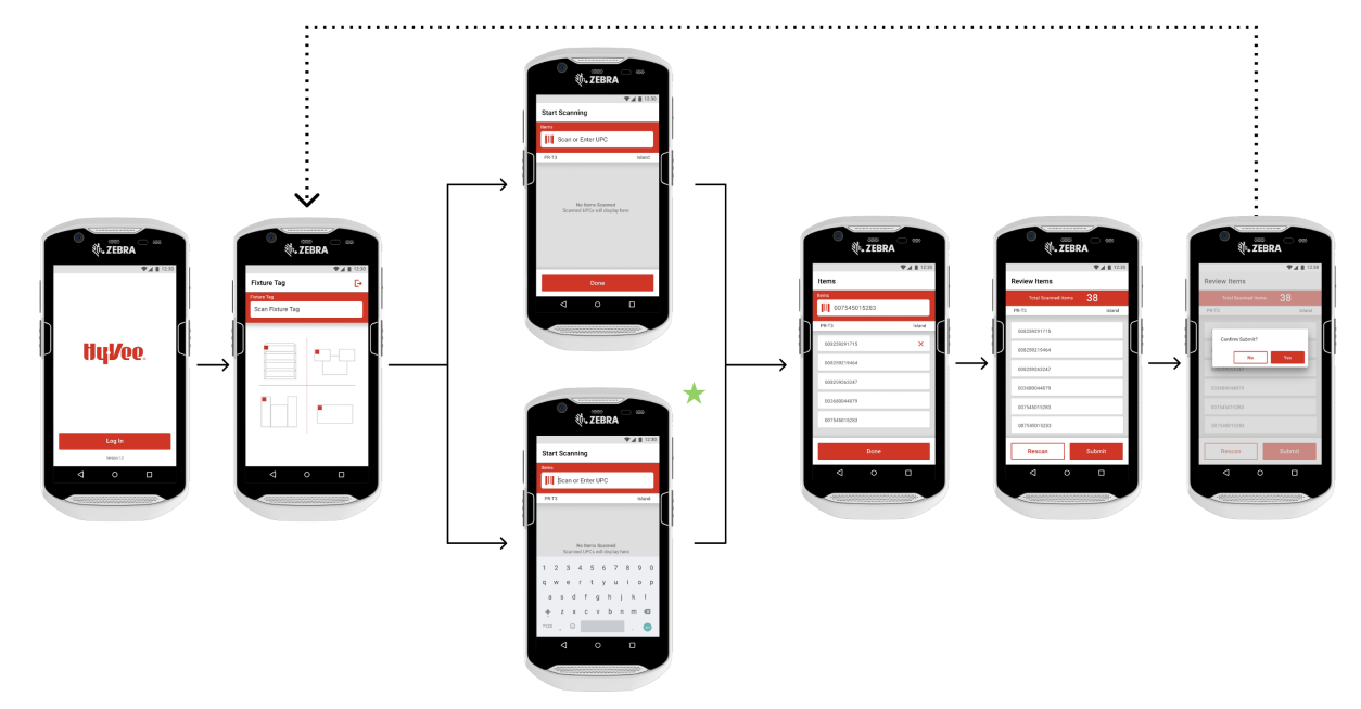
A hidden barcode on each three-foot section of shelving connected that physical location to its digital inventory.
One system could now serve both human navigation and inventory management.

Same place. Different level of detail.
TESTING THE DETAILS
One seemingly minor decision could affect how thousands of people understood the system:
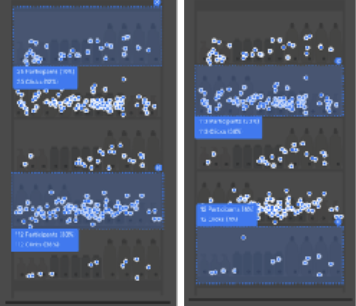
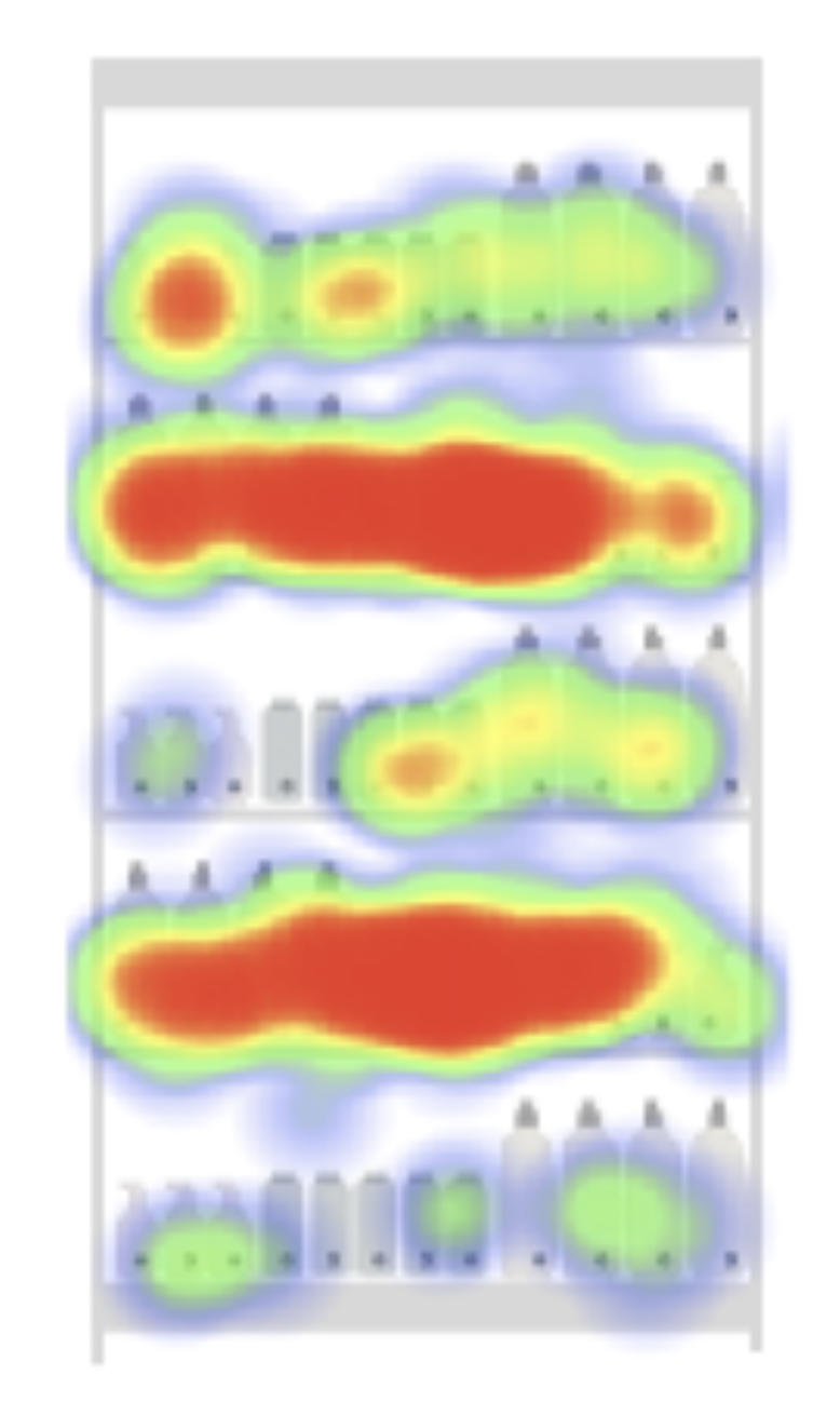
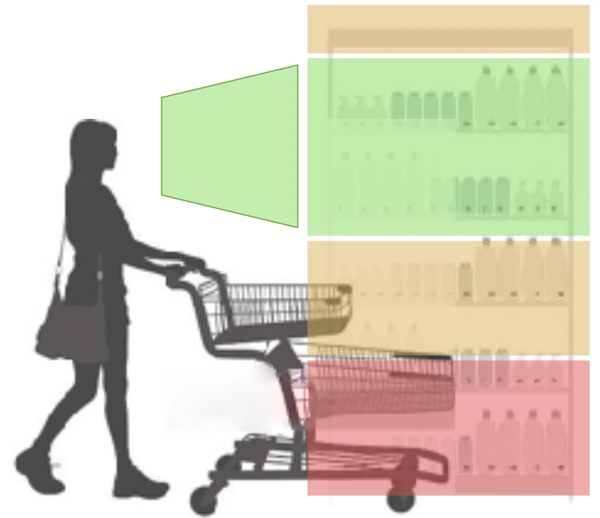
Should shelf positions be numbered from top to bottom, or bottom to top?
I ran a click test with 383 customers, asking participants to locate products based on shelf and position information.
The result gave us a statistically significant direction:
TOP → BOTTOM
A small decision, grounded in evidence, became part of a much larger system.


FROM SYSTEM TO STORE
The first stores became another research environment.
I shadowed employees during rollout, observed customers navigating the new experience, and looked for the things we couldn't have anticipated from behind a desk. Reality found the things research couldn't.
The barcode stickers were one example:
The first adhesive failed in freezer sections.
The next material couldn't withstand the moisture from produce misters.
So we tested again.
The system wasn't finished when the prototype was finished.
And the goal wasn't to design something that worked in a prototype.
It was to design something that could survive the store.
+39%
INVENTORY EFFICIENCY
A process that had once required a large overnight crew could be transformed into a more structured, shelf-level workflow.
And for customers:
18%
FASTER PRODUCT SEARCH
A clearer location system helped people find products with less friction while creating a foundation for more connected digital experiences.
WHAT STAYED WITH ME
This project reminded me that good UX isn't always about designing a screen.
Sometimes it's about designing the relationship between a person, a physical environment, and the invisible systems underneath it.
The best solution wasn't the cleverest naming convention.
It was the one that could make sense to a shopper looking for pickles, an employee managing inventory, an engineer building the system, and a store with a completely different layout—all at the same time.
That's the kind of complexity I like working on.
MORE WORK
When the system gets in the way
Insurance Operations →
Rewriting the rules of an old system
Grocery Item Pricing →
Designing for people in a hurry
Convenience Store Checkout →
Designing a shared memory
Internal Knowledge Base →
LET’S WORK TOGETHER
Have a complicated product, workflow, or system that needs a closer look?